
We continue in our commitment to improve our existing resources. In our thirty-second database upgrade and the last one for 2023, we have significantly improved the user experience when viewing our databases on screens smaller than thirteen inches, especially on tablets and mobile devices. Navigation is more efficient, and records are displayed with greater clarity. These changes affect all our databases:
- Title IX Lawsuits Database and its Free Trial
- OCR Resolutions Database
- Attorneys Directory
- Regulation Challenges Database
For this upgrade, we examined every database module – every data table, map, list, search engine, and so forth – to determine if presentation and interactivity could be improved for smaller screens. In about one third of cases, we re-imagined and re-created modules from scratch that will display exclusively on smaller screens. In another one third of cases, we found that tweaking existing modules was sufficient. In the last third of cases, we determined that existing database modules already translated well to smaller screens and that no further changes were needed.
To simplify, about two thirds of the database structure as displayed on mobile and tablet devices is improved. Below, we’ll give examples of these changes and then discuss some additional considerations and implementations.
Examples of Improvements
Table Views Converted to Card Views on Smaller Devices
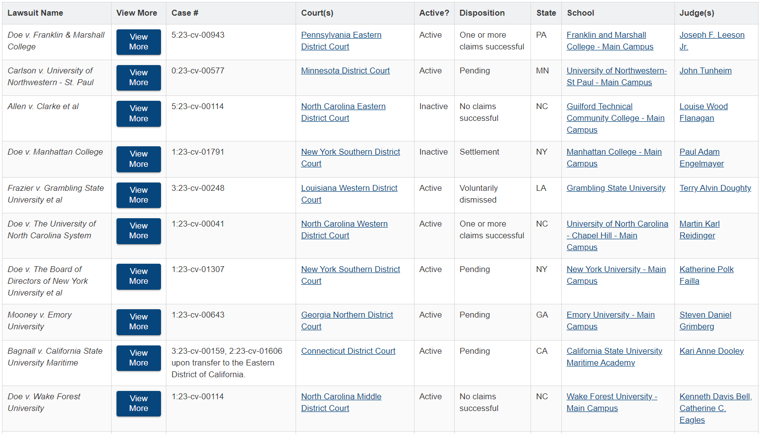
Previously, while our databases were accessible on mobile devices, they were primarily structured toward desktop viewing. Smaller devices could display them, but not optimally. As an example, consider this screenshot of a table of lawsuits as displayed on a desktop computer:
Now look at how that same table would display on mobile devices before this upgrade:
As the mobile screenshot shows, users could view the offscreen portion of the table by scrolling horizontally and additional records by scrolling vertically, but this was too laborious, and it was clear the data were not arranged optimally.
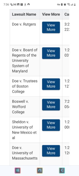
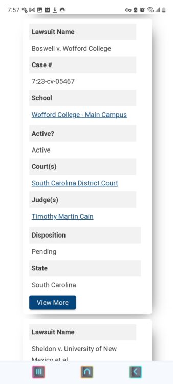
We have converted all tables to a “card” layout when viewing them on mobile and tablet devices. As an example, here is what it now looks like when viewing the same lawsuit horizontally on a mobile device (this is also similar to the new tablet view):
And below are before and after screenshots of what viewing the same table of lawsuit records looks like on a mobile device when holding your phone vertically:
Old Mobile Vertical View
Most of the lawsuit record is cut off. Users must scroll horizontally and vertically to view more data.
New Mobile Vertical View
The lawsuit record is neatly contained in a “card.” Users need only scroll vertically to view additional data.
This change affects not only lawsuit tables, but also court, school, attorney, judge, OCR office, OCR personnel, oral argument, and other tables.
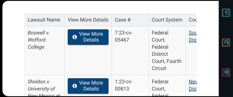
New List Views
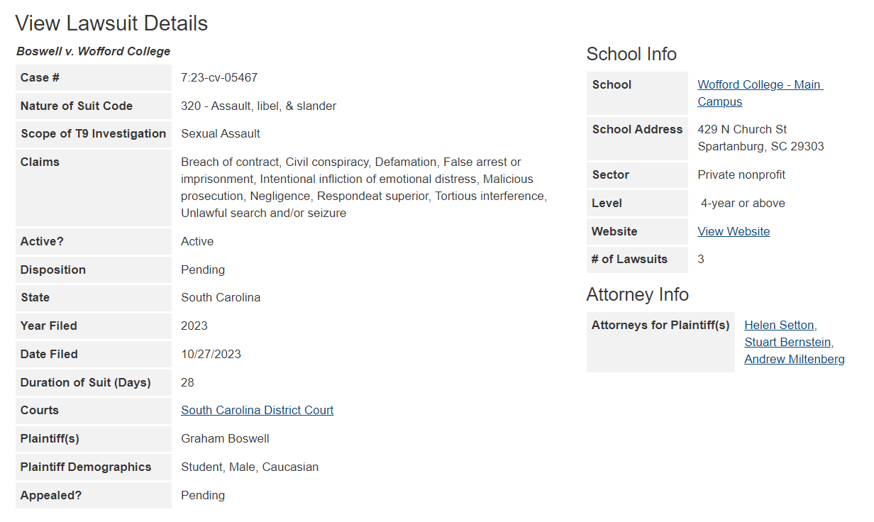
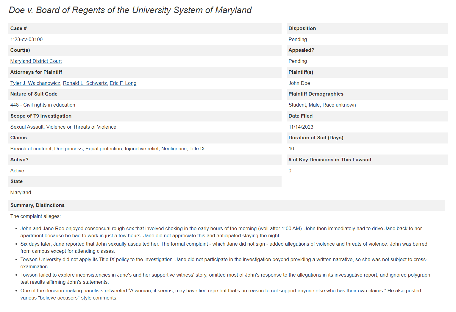
To drill deeper into a specific record – say, a lawsuit, judge, OCR office, or attorney record – users would be directed to “Detail” pages by “View More” buttons such as the ones shown in the screenshots above. These Detail pages present all the information we have on that record, with much of that data displayed in a list view.
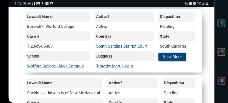
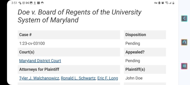
Traditionally, we have oriented the labels for each data category to be leftward of the data. This posed a challenge when displaying data on smaller devices, especially vertically on mobile devices.
Here, we found tweaking existing structures sufficient rather than re-creating them entirely, meaning the desktop, mobile, and tablet versions have all been updated. The columns will naturally reposition when viewed on smaller devices. You can see this in the below old and new examples:
Old Desktop View
New Desktop View
Old Vertical Mobile View

New Vertical Mobile View

Old Horizontal Mobile (Similar to Old Tablet) View

New Horizontal Mobile (Similar to New Tablet) View
Examples from the OCR Resolutions Database
The above examples come from the Title IX Lawsuits Database. Here are some examples from the OCR Resolutions Database.
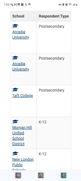
OCR Resolutions Table, Old Mobile Horizontal View
Similar to the table of lawsuits from the Title IX Lawsuits Database, about 60% of the tables of OCR resolutions were cut off and required excessive navigation to view. We fixed that by changing the table view to a card view (see next several screenshots).
OCR Resolutions List, New Mobile Horizontal View
Old Mobile Vertical View
Only two columns of data per resolution were shown. Users must scroll horizontally and vertically to view more data.
New Mobile Vertical View
All data points are neatly contained in a “card.” Users need only scroll vertically to view additional data.
Additional Considerations and Implementations
We’d like to address a few curiosities that we came across and imagine a few users may have as well.
Court Naming Conventions
Since a key element of this upgrade is optimizing space, we revisited the naming conventions for much of our data, including courts. If we used the full name for each court – such as “U.S. District Court for the Eastern District of Pennsylvania” – users would quickly find the size of database tables ballooning to an excessively large portion of the screen while not presenting enough meaningful data to justify that kind of space.
However, if we were to exclusively use bluebook abbreviations for courts such as D.S.C. or D.R.I. (U.S. District Court for the Districts of South Carolina and Rhode Island, respectively), our users who are not legal professionals (a bit over half of our user base) would have much greater difficulty identifying the courts at a glance.
Having experimented with multiple naming conventions, we will continue to use the convention used by PACER (e.g., “New York Southern District Court”) for federal courts as this appears to be a reasonable middle-ground.
Ultrawide Monitors
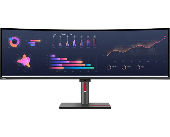
Desktop viewing has been normalized for screens thirteen inches or larger. There is some play in the joints depending on what you are viewing but not that much. Any broad range above that – such as above thirty inches – is getting into ultrawide monitor territory. Ultrawide monitors will easily display all the modules and data available in our databases, but the current downside of using an ultrawide monitor is that the screen will display a larger amount of white space in certain areas where additional data could otherwise be displayed.
Since we spend a considerable amount of time working with large spreadsheets with dozens of columns, we are enthusiastic ultrawide users but recognize that we are in the minority. Beyond the traditional single-monitor setup, dual monitor use is much more common than ultrawide, so when it comes to optimizing for desktop viewing we will prioritize screens between thirteen and thirty inches.
That being said, we are open to looking into optimizing for ultrawide monitors in the future, but other initiatives will be taking priority for quite a while.
Additional Implementations
We have made a few minor additions and subtractions that we believe will provide a better overall user experience.
Judge Photos
We have removed judge photos from the databases. While it was nice to see a judge’s professional photo, such images were a particular offender for space constraints, especially in tables. Additionally, judge photos often varied wildly in resolution and other markers of quality, and they were unavailable in too many cases. On balance, we thought it best to remove them.
Oral Argument Case Numbers
Wherever oral arguments records are displayed, their associated case number fields will now only display the case number for that particular oral argument rather than all the case numbers for the lawsuit. This change will make searches more precise and cut down on excessive table sizes, especially for smaller devices.
“Number of Key Decisions” Tally
For the Title IX Lawsuits Database, we have updated court tables, court “Detail” pages, and court search engines to include a tally of the number of key decisions (e.g., Motions for Summary Judgment, Motions to Dismiss, etc.) made by that court.
Other Minor Changes
We have made a few other changes due to space concerns and to normalize tables for desktop, mobile, and tablet sizes. States are now always displayed by their abbreviations (e.g., MA instead of the much longer Massachusetts). Button sizes have also been reduced so that they are still conspicuous but not as greedy with regard to space.
Conclusion
This is the thirty-third upgrade to our databases since we relaunched the Title IX Lawsuits Database in November 2018 and the final upgrade for 2023. You can see a full list of all upgrades here. Thank you for your interest and support of our work. We look forward to discussing our future plans soon.
Thank You for Reading
If you like what you have read, feel free to sign up for our newsletter here:
About the Author
Related Posts


We continue in our commitment to improve our existing resources. In our thirty-second database upgrade and the last one for 2023, we have significantly improved the user experience when viewing our databases on screens smaller than thirteen inches, especially on tablets and mobile devices. Navigation is more efficient, and records are displayed with greater clarity. These changes affect all our databases:
- Title IX Lawsuits Database and its Free Trial
- OCR Resolutions Database
- Attorneys Directory
- Regulation Challenges Database
For this upgrade, we examined every database module – every data table, map, list, search engine, and so forth – to determine if presentation and interactivity could be improved for smaller screens. In about one third of cases, we re-imagined and re-created modules from scratch that will display exclusively on smaller screens. In another one third of cases, we found that tweaking existing modules was sufficient. In the last third of cases, we determined that existing database modules already translated well to smaller screens and that no further changes were needed.
To simplify, about two thirds of the database structure as displayed on mobile and tablet devices is improved. Below, we’ll give examples of these changes and then discuss some additional considerations and implementations.
Examples of Improvements
Table Views Converted to Card Views on Smaller Devices
Previously, while our databases were accessible on mobile devices, they were primarily structured toward desktop viewing. Smaller devices could display them, but not optimally. As an example, consider this screenshot of a table of lawsuits as displayed on a desktop computer:
Now look at how that same table would display on mobile devices before this upgrade:
As the mobile screenshot shows, users could view the offscreen portion of the table by scrolling horizontally and additional records by scrolling vertically, but this was too laborious, and it was clear the data were not arranged optimally.
We have converted all tables to a “card” layout when viewing them on mobile and tablet devices. As an example, here is what it now looks like when viewing the same lawsuit horizontally on a mobile device (this is also similar to the new tablet view):
And below are before and after screenshots of what viewing the same table of lawsuit records looks like on a mobile device when holding your phone vertically:
Old Mobile Vertical View
Most of the lawsuit record is cut off. Users must scroll horizontally and vertically to view more data.
New Mobile Vertical View
The lawsuit record is neatly contained in a “card.” Users need only scroll vertically to view additional data.
This change affects not only lawsuit tables, but also court, school, attorney, judge, OCR office, OCR personnel, oral argument, and other tables.
New List Views
To drill deeper into a specific record – say, a lawsuit, judge, OCR office, or attorney record – users would be directed to “Detail” pages by “View More” buttons such as the ones shown in the screenshots above. These Detail pages present all the information we have on that record, with much of that data displayed in a list view.
Traditionally, we have oriented the labels for each data category to be leftward of the data. This posed a challenge when displaying data on smaller devices, especially vertically on mobile devices.
Here, we found tweaking existing structures sufficient rather than re-creating them entirely, meaning the desktop, mobile, and tablet versions have all been updated. The columns will naturally reposition when viewed on smaller devices. You can see this in the below old and new examples:
Old Desktop View
New Desktop View
Old Vertical Mobile View
New Vertical Mobile View
Old Horizontal Mobile (Similar to Old Tablet) View
New Horizontal Mobile (Similar to New Tablet) View
Examples from the OCR Resolutions Database
The above examples come from the Title IX Lawsuits Database. Here are some examples from the OCR Resolutions Database.
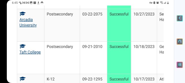
OCR Resolutions Table, Old Mobile Horizontal View
Similar to the table of lawsuits from the Title IX Lawsuits Database, about 60% of the tables of OCR resolutions were cut off and required excessive navigation to view. We fixed that by changing the table view to a card view (see next several screenshots).
OCR Resolutions List, New Mobile Horizontal View
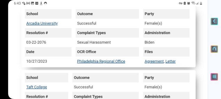
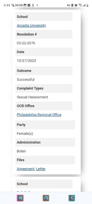
Old Mobile Vertical View
Only two columns of data per resolution were shown. Users must scroll horizontally and vertically to view more data.
New Mobile Vertical View
All data points are neatly contained in a “card.” Users need only scroll vertically to view additional data.
Additional Considerations and Implementations
We’d like to address a few curiosities that we came across and imagine a few users may have as well.
Court Naming Conventions
Since a key element of this upgrade is optimizing space, we revisited the naming conventions for much of our data, including courts. If we used the full name for each court – such as “U.S. District Court for the Eastern District of Pennsylvania” – users would quickly find the size of database tables ballooning to an excessively large portion of the screen while not presenting enough meaningful data to justify that kind of space.
However, if we were to exclusively use bluebook abbreviations for courts such as D.S.C. or D.R.I. (U.S. District Court for the Districts of South Carolina and Rhode Island, respectively), our users who are not legal professionals (a bit over half of our user base) would have much greater difficulty identifying the courts at a glance.
Having experimented with multiple naming conventions, we will continue to use the convention used by PACER (e.g., “New York Southern District Court”) for federal courts as this appears to be a reasonable middle-ground.
Ultrawide Monitors
Desktop viewing has been normalized for screens thirteen inches or larger. There is some play in the joints depending on what you are viewing but not that much. Any broad range above that – such as above thirty inches – is getting into ultrawide monitor territory. Ultrawide monitors will easily display all the modules and data available in our databases, but the current downside of using an ultrawide monitor is that the screen will display a larger amount of white space in certain areas where additional data could otherwise be displayed.
Since we spend a considerable amount of time working with large spreadsheets with dozens of columns, we are enthusiastic ultrawide users but recognize that we are in the minority. Beyond the traditional single-monitor setup, dual monitor use is much more common than ultrawide, so when it comes to optimizing for desktop viewing we will prioritize screens between thirteen and thirty inches.
That being said, we are open to looking into optimizing for ultrawide monitors in the future, but other initiatives will be taking priority for quite a while.
Additional Implementations
We have made a few minor additions and subtractions that we believe will provide a better overall user experience.
Judge Photos
We have removed judge photos from the databases. While it was nice to see a judge’s professional photo, such images were a particular offender for space constraints, especially in tables. Additionally, judge photos often varied wildly in resolution and other markers of quality, and they were unavailable in too many cases. On balance, we thought it best to remove them.
Oral Argument Case Numbers
Wherever oral arguments records are displayed, their associated case number fields will now only display the case number for that particular oral argument rather than all the case numbers for the lawsuit. This change will make searches more precise and cut down on excessive table sizes, especially for smaller devices.
“Number of Key Decisions” Tally
For the Title IX Lawsuits Database, we have updated court tables, court “Detail” pages, and court search engines to include a tally of the number of key decisions (e.g., Motions for Summary Judgment, Motions to Dismiss, etc.) made by that court.
Other Minor Changes
We have made a few other changes due to space concerns and to normalize tables for desktop, mobile, and tablet sizes. States are now always displayed by their abbreviations (e.g., MA instead of the much longer Massachusetts). Button sizes have also been reduced so that they are still conspicuous but not as greedy with regard to space.
Conclusion
This is the thirty-third upgrade to our databases since we relaunched the Title IX Lawsuits Database in November 2018 and the final upgrade for 2023. You can see a full list of all upgrades here. Thank you for your interest and support of our work. We look forward to discussing our future plans soon.
Thank You for Reading
If you like what you have read, feel free to sign up for our newsletter here:
More from Title IX for All

Advisors for Accused Students
We can help you craft and execute a defense strategy at any stage—from report to investigation to adjudication—with the goal of achieving the best possible outcome.

Accused Students Database
A feature-rich database of lawsuits by accused higher ed students alleging schools violated their rights while investigating sexual misconduct claims.